Thursday, December 2, 2010

Altered Book


Another altered book entry with the usual materials. It is not done because I still need to add some found images and a focal point.

Thursday, October 21, 2010

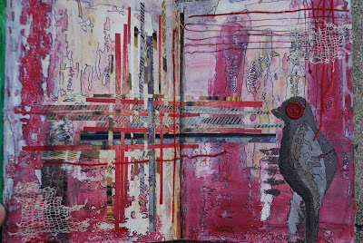
"Glory" Altered Book


I used the same technique that I have been using with creating a background out of paint and outlining the organic shapes. After that, I practiced the weaving technique with different found papers and threads. I also painted a simple bird and used a button to create an eye. Its not my favorite, but I think that it was good practice with the weaving technique.

"Blinded" Altered Book


Yet another unfinished piece... I started creating a background with assorted paint and stamps. Then I couldn't decide if it was TOO busy and was hesitant to continue. I outlined several of the shapes with a Sharpie marker. I also used the Sharpie to write in different layers of the paint. Will post more pictures at a later date.

"Reflections" Altered Book


As you may be able to tell, this entry is not yet finished. I still haven't found the perfect image to feature. Thus far, I used paint, wax, wax paper, thread, found papers, lace, and a Sharpie marker. I used the same technique that I have used in previous altered book entries. Because the prompt was "Reflections" I painted both pages and then closed the book pressing the pages together. Then, I reopened it and the paint had created a mirror image of each page. After this, I continued doctoring the piece and making the paint look how I wanted to. I had trouble with getting the intensity of the colors to match what I visualized them to be. As I finish this, I will post more pictures.

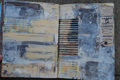
"Redemption" Altered Book


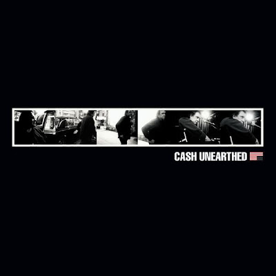
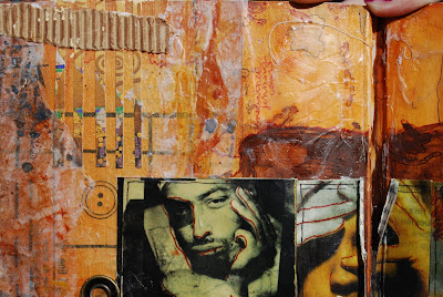
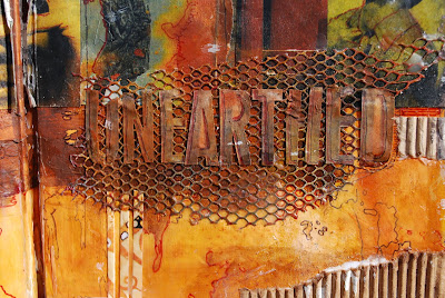
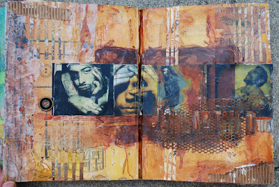
This altered book entry is one of my favorite so far. I really REALLY like it. I was inspired by the Johnny Cash album "Unearthed" because one of the tracks is "Redemption." The actual album is picture above. I wanted to create a reel of photos and a simple title underneath them, like the format of his album cover. After deciding my layout, I focused on color scheme and embellishing the piece. I used paint, wax, wax paper, thread, corrugated cardboard, found papers and found objects. I think that this is a good entry because of how detailed it is and how many layers there are. Because I created it, I recognize each layer individually. I also traced over the natural shapes within the paint and image, creating a contour line with a deep red Sharpie marker. I think that this piece was a success.

"Down the Drain" Altered Book


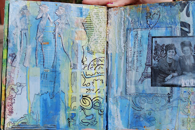
As my second altered book entry, I continued to experiment with style and technique as well as materials. The prompt was "Down the Drain" for which I wrote a limerick... "Up in smoke, down the drain, the cookie crumbles all the same." From this, I had inspiration for my piece. I used a light blue color scheme to represent water (from the drain) and added water to the paint so that it would drip and spread more fluidly. I also drew a very wavy, fluid pattern that represented water. Next, I represented smoke by the picture of the two old women smoking. I also continued drawing the pattern coming out of their cigarettes. I also had an image of the eiffel tower and I drew smoke coming out of it as if it was a chimney. I also outlined quite a few of the natural shapes that the paint made with a sharpie. I love highlighting this organic element of the composition. I think this was yet another success.

"Making Time" Altered Book


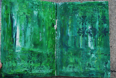
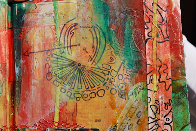
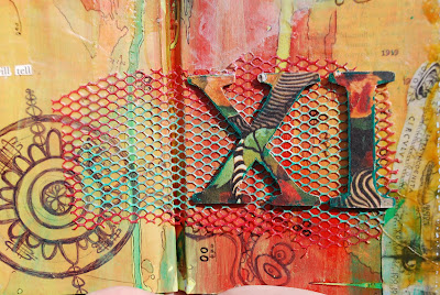
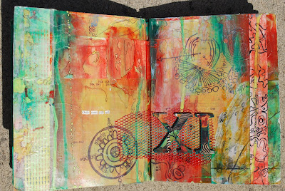
The green page is the contents page of my altered book that I used acrylic paint to create. The next several images of the green/orange pages are my first altered book entry. The prompt was "Making Time." As a mixed media piece, I explored my style, taking a risk. I really love how this turned out. I used paint, wax, thread, chipboard, sharpie, wax paper and other found materials. The images that I drew with the sharpie represent constallations that are believed to tell time. I was really proud of how this piece turned out and I think that I will definitely be creating several more formal pieces within this style.

Tuesday, October 19, 2010

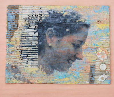
Image Transfer with Texture


Step 1: Create a background using texture paste that I mixed with acrylic paint. The three colors I used were a light yellow, light blue, and salmon. I really liked the texture in the background. It reminded me of weathered furniture or chipping paint on wood. I really like that look and it reminds me of one of my favorite interior design styles. Step 2: Take a picture using a Nikon camera and a model. Print image with laser jet printer and carefully create image transfer on textured surface. Step 3: Continue adding the tinted texture paste on top of and around the image transfer. Step 4: Embellish the piece with thread, pins, buttons, corrugated cardboard, found papers and found objects. I think this piece was my biggest success thus far. However, I really don't like it because I wanted to make the image transfer become a fluid part of the piece and I feel like I failed at that. Comments?

India Ink


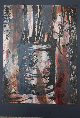
The assignment for this piece was to create a background using found papers, lightly gesso that background and then use india ink to draw a 'quick, sketchy' image on the background. I really despise the whole 'quick,sketchy' thing. I think that it makes the pieces look sloppy and I am not very good at 'letting loose.' It involved taking a risk and I was uncomfortable with the medium and the technique, which made the risk all the harder to take. I like the background in which I used newspaper and assorted colors of tissue paper. I do not like the image that is on top... It is supposed to be a canister full of dirty paintbrushes of all different sizes. I used parafin wax to seal the entire thing. In my opinion, not a success.

Erasure Drawing


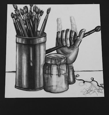
The erasure technique consists of drawing a composition, erasing it, and then re-drawing the image in a slightly different position so that it looks as if the image is moving... I wasn't a huge fan of this technique when it was introduced. I thought that it would just look like poor craftsmanship to have erased lines all over the paper. I used different drawing pencils to shade and decided that the model hand would be the "moving object." I used the sign language hand gesture for 'I love you.' This gesture has a special meaning to me and I like that it was incorporated in my piece. However, I wish that I would have spent more time making the erasure technique more evident. It is rather subtle. This piece is decent, but I don't prefer drawing and I think that I am better at design.

Thursday, August 19, 2010

AP Summer Art Project #5: NOT DONE.


So, I was instructed to take a risk... I just started drawing. I know it isn't one of the prompts, but I took a risk. As stated in the title, this is no where near finished. The picture is pretty bad quality. It was taken with a cell phone, so sorry. But, I wasn't sure that it was worth finishing.

Monday, July 26, 2010

AP Summer Project #4: Architectural Structure


Once again, a little more non-conventional. I tried a new technique, combining encaustic and Liquitex. I cute out 24 small squares, 24 medium squares, and 24 large squares. The smallest squares are composed of a marketplace scene in New Mexico on a postcard from the fifties or sixties. If you imagine that the smallest squares are pushed together as one unit, you can see the image as a whole. To help you identify this, look at the first column, second row. You will notice that in this square, the lower half is a darker/royal blue. Bring your attention to the square to the right of this square (column two, row two) and you will notice that the royal blue from the last square is continued in this square. This blue comes together to create a mountain in the background. In the foreground, people are gathered around a marketplace watching a parade of sorts. The medium and large squares are made of papers that showcase other New Mexican locations. After I encausted the three layers of squares together, I embellished them with thread, pins, wire, lace, ribbon, buttons, snaps, and even a brooch/ pendant (as the focal point). To create the background I placed a large piece of lace onto paper and used colored wax to create a rust orange, attaching the lace to the paper. After the wax had dried, I peeled the lace off of the large sheet of paper. The lace now had the same rust orange color as the background. I used Liquitex to attach it to a fresh white piece of paper. After it dried I attached all of the smaller squares with another coat of Liquitex. After this step was complete, I had a nearly finished product. I used the rust orange colored paper that I had pulled the lace off of to create a mat for the piece as a whole. The rust orange colored piece has a relief of the lace, which was a subtle but nice effect. I really like the idea for this piece. I hope that the architectural design is still identifiable in the photo. So, four down, ONE (summer piece) to go! :)

Monday, July 12, 2010

AP Summer Project #3: Inside of a Closet


Summer Piece #3: The Inside of the Closet. Like my second summer piece, this is not an obvious "closet." Instead, I thought of the inside of a closet. Things like clothes, shoes, jewelry, etc.(fashion) came to mind. Instead of focusing on the closet itself, I focused on it's contents. I used wax, pins, found papers, embroidery thread, thread, lace, and an antique button to create this. The lady in the center image is admiring her own shoes. I thought that she looked very "Flapper-esque", in turn she appeared to be very stylish. I also used the antique embellishment in the bottom-left corner. I thought that the colors in the button brought out the colors in the found papers. I experimented with a new technique (I couldn't really capture this with the camera) in which I ironed a piece of lace onto the center and peeled it off after it had dried. It created a texture that was more or less a relief of the lace. It turned out pretty neat. I have recently noticed that I enjoy playing with horizontal and vertical lines in my pieces. The lines are usually different lengths or widths, creating variety...This could possibly evolve into a minor concentration??? Apart from that, I couldn't decide if I liked the silver wax matting behind the image or not. I tried photographing it with and without the mat. Opinions? I think that I like it, but I am not completely convinced. I thought that it would be interesting to experiment with using the metallic mat to enhance the metallic details in the piece itself. Overall, I would say that I am slightly disappointed in this. It isn't horrible, I just had a completely different image in my head. I think that I really like the prompt, but I wish that I could have done a better job carrying out my plan. I definitely think that I will come back to this prompt at a later date.

Monday, June 28, 2010

AP Summer Project #2: Inside of a Cabinet


So, this is my second AP summer project. The prompt was 'the inside of a cabinet.' Obviously, I took a different approach than a conventional cabinet. Looking inside of the kitchen cabinet, I was inspired by a Morton Salt can. From this inspiration, the wheels in my head started turning and I created yet another mixed media piece. I used encaustic wax, found papers, cardboard, pins, wire, thread, lace, and embroidery thread. The piece showcases the evolution of the Morton Salt girl. From 1914 to 1968 the character of the Morton Salt girl was depicted in six different aged girls. Throughout the years, the young girl appears to grow older. I also incorporated the Morton Salt slogan, 'When it rains it pours.' Using encaustic wax, I layered a clear parafin along with a yellow and blue wax. I chose yellow and blue because those are the colors used on the Morton can. Overall, I think that this piece was a success. I thought that it could still be identified as an "Abby piece".

Monday, June 14, 2010

First Summer Project: Inside a Dishwasher


While this is a HORRIBLE picture and the piece is not yet mounted, this is my first AP summer project! The prompt was "The Inside of a Dishwasher." Of course, I put my own twist into the prompt. I used a variety of materials to create this encaustic piece. Instead of focusing only on the dishwasher, I decided to incorporate the idea of the Dishwasher Revolution. The burden of doing dishes was no longer a problem when the dishwasher was invented in the 1950's. Women were excited to have less work and this is demonstrated in this piece.