Monday, June 28, 2010

AP Summer Project #2: Inside of a Cabinet


So, this is my second AP summer project. The prompt was 'the inside of a cabinet.' Obviously, I took a different approach than a conventional cabinet. Looking inside of the kitchen cabinet, I was inspired by a Morton Salt can. From this inspiration, the wheels in my head started turning and I created yet another mixed media piece. I used encaustic wax, found papers, cardboard, pins, wire, thread, lace, and embroidery thread. The piece showcases the evolution of the Morton Salt girl. From 1914 to 1968 the character of the Morton Salt girl was depicted in six different aged girls. Throughout the years, the young girl appears to grow older. I also incorporated the Morton Salt slogan, 'When it rains it pours.' Using encaustic wax, I layered a clear parafin along with a yellow and blue wax. I chose yellow and blue because those are the colors used on the Morton can. Overall, I think that this piece was a success. I thought that it could still be identified as an "Abby piece".

Monday, June 14, 2010

First Summer Project: Inside a Dishwasher


While this is a HORRIBLE picture and the piece is not yet mounted, this is my first AP summer project! The prompt was "The Inside of a Dishwasher." Of course, I put my own twist into the prompt. I used a variety of materials to create this encaustic piece. Instead of focusing only on the dishwasher, I decided to incorporate the idea of the Dishwasher Revolution. The burden of doing dishes was no longer a problem when the dishwasher was invented in the 1950's. Women were excited to have less work and this is demonstrated in this piece.

Monday, January 11, 2010

#2 in the Circles Series


So, I used found papers, wire, metal sewing embellishments, thread, lace, ribbon, buttons, pins, etc... to create this one. I decided that it would be neat to do a horizontal row of circles. So, after I used encaustic wax, covering each circle, it was time for the background. I layered the transparent brown paper from a sewing pattern about six times. I covered that in parafin wax and a small amount of white and yellow beeswax. I Then, I placed all of my circles, horizontally, across the background. My teacher suggested that I give the circles some kind of order since they were horizontal. But, we decided that using "A,B,C" to letter the circles or "1,2,3" to number the circles would look silly. So, I came up with another idea. If you look closely, there is a silhouette of a small, black sparrow in a different stage of flight in each circle. The bird starts walking and eventually flies away (going towards the left). Not only did the bird give the final product interest, but it gave each circle a focal point. If you click on the photo, you can see it even bigger. Just like in the last piece, a pretty good deal of detail went in to each circle. I really like how this one turned out. It might even be my favorite project this semester. How does it look?

My Inspiration for "The Circle Series"


So, as you may know, I have recently started to create a small series (so far there are only two, but I'm working on that). I use different found papers and a variety of other materials to create perfect, geometric circles. But, believe it or not, the idea of layering circles was not all that original. Wassily Kandinsky ( 1896 - 1944) is the artist of the paintings above. When I first saw the painting (the one on the very top), I commented that it looked like a seven-year-old could do it. But, upon further investigation, I discovered that the painting was not famous because of Kandinsky's ability to paint a perfectly round circle (obviously). It became famous because of his brilliant use of complimentary colors. Notice that all of the colors in the painting play off of one another, creating harmony. He also combined different thickness of lines, and created contrast and variety by placing straight lines next to circles. Kandinsky had an ever-changing style. In his younger years his paintings were very realistic, resembling Monet(INSPIRATION). In later years, his focus seemed to be very architecturally based. Some of these works resembled the style of Van Gogh or George Seurat (pointillism)(& INSPIRATION). Some of the later work was based on really abstract architecture. It could be compared to the shapes that Dr.Suess uses (INSPIRATION). It also resembled the artist that came to our class and presented "The Traveling Man."(INSPIRATION) Finally, Kandinsky created several pieces that used symmetry and geometry.

And then there is me... Abby. I have taken Kandinsky's art and made it my very own. Just like Kandinsky's pieces resemble those of other famous artists and techniques, my pieces resemble his. I took the concept of layering circles and using complimentary colors and I decided to take my own spin on Kandinsky. So, there you have it folks, it's okay to be inspired. Kandinsky proved that to me. (:

The FIRST in My Series of Circles


The task: 48 circles(there are 16 big circles,16 medium,16 small), each in different combinations of papers and embellishments, all coming together to create "my spin on Kandinsky." So, to complete this I needed a LOT of materials. A wide variety of found papers, buttons, pins, thread, wire, string, lace, ribbon, fabric and liquitex. This project is a 12x12in. and, believe me, it took what seemed like ages(about two weeks in class). I was very meticulous about cutting each circle with precision after I traced them. But, the bigger task was trying to come up with 16 different combinations of papers so that none of the circles looked alike. Another big challenge was laying the circles out so that some of the repeated papers were not close to one another. As I was in the process of creating this, I also decided that I wanted it to have a shiny finish, thus the liquitex. But, when I put the circles on the plain chocolate brown cardstock I encountered a minor problem... The mat looked WAYYY too simple compared to the very detailed circles. So I placed thread in the liquitex and I think that gave it a nice final touch. This is actually double-matted, which you cannot see from this photo. There is a light pink mat behind the brown one. I decided that pink would be an appropriate and flattering color. The pink mat complimented the pink in the circles. I really liked this project. One of my favorite so far. (:

SO... This is my first independent piece as an artist. Without any prompt from my teacher, I created an assignment for myself. In this picture the color looks a little distorted. It isn't that dark. Obviously, this is mixed media. I used acrylic paint, liquitex, buttons, lace, found objects, found images, pins, thread, and matboard. I really like it. As I intendended, it turned out looking very vintage. I really love the way that aged things look, so I try to incorporate them into my artwork. I also cut a dress form out of thick cardstock paper and painted it (on the left side). The research workbook pages below were where I developed my ideas and techniques for this piece. There are also two seperate image transfers. The first is the damisk print bordering the top. The second is the print, which reads "Une Femme Elegante" (Elegant Woman). Comments, questions, concerns?

Thursday, January 7, 2010

Coming to an end...

Even though this semester is ending, I have something to look forward to. Ever since my art teacher has allowed the class to start our independent studies, I have really started to find myself as an artist. I have discovered that I really enjoy mixed media. More specifically, I love incorporating buttons, lace, ribbon, found papers, found images, vintage sewing accessories, pins, sewing needles, thread, acrylic paints, encaustic wax, Liquitex, and quite a few other mediums in my artwork. I am really eager to get to work on my summer pieces and become part of the AP art program. While I still have to work out a lot of kinks in my process, I am enjoying every minute of the adventure. In this semester I have made so many discoveries as an artist. I have really grown and developed a personal style. I have also grown to better understand and respect art of all different kinds. I am really glad that I was given the opportunity to take this class. I made so many improvements, not to mention some great friends and confidants. Everything I have taken away from this semester really makes it worth the while. Can't wait until next year. (:

Friday, November 20, 2009


More planning for my mixed media project...


These are all Research Workbook pages I did to plan for and experiment with ideas for my mixed media project.


MORE Research Workbook


More Research Workbook... PostSecret style

Research Workbook (:

Wednesday, November 4, 2009


I think that this project turned out alright. I used acrylic paint. I tried to create really exaggerated foreshortening and perspective. I think my favorite part is the background. It ties together the color scheme, just as I intended. I think its a very fun look. But, I wish I was a better painter... oh well, better luck next time.

Monday, November 2, 2009

Oil Pastel


This is my oil pastel piece. I decided to do a positive/negative space kind of thing. I really like how the circles are replicated throughout. I think this was a pretty neat piece. But, I only spent a few days on it. It might look better if I developed it more.

Thursday, October 22, 2009


MORE from the research workbook using Sharpie and watercolor.

Research Workbook


These are just more pictures from my research workbook. I used watercolor and sharpie on one. I used found papers and fabric on the other.


One of these is done with Prismacolor and Sharpie. The other is just Crayola markers.

Research Workbook


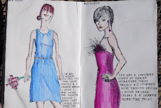
More fashion designs using watercolor, Prismacolor, and Sharpie...

Research Workbook


These are fashion designs- one of my favorite things to do. I just used Prismacolor and Sharpie.

Friday, October 16, 2009

Encaustic Painting and Mixed Media


This is my favorite project so far. I don't particularly like mine, but the idea was awesome. We melted wax onto our collages to create vibrant color and texture. It was really fun to make. Overall, I like it.

Synthetic Cubism


This was my synthetic cubism project. I used a variety of found
papers, paint, and shoepolish to create this piece. I thought that it was okay. Again, not my favorite project. I tried to create a triangle using the blue ladies. I also added som smaller details that the photograph didn't capture.

Timed Gesture Drawings


We had one minute to draw these figures. They are very sketchy and I just used a Prismacolor soft pastel. It was pretty difficult and I honestly don't like mine. Thank goodness it was only practice. .

Figure Value Studies


For this project we were supposed to create a figure using value and it was optional to create foreshortening. I used different colors of charcoal to create this. I think that it turned out okay. But, I think that I should have colored in some more of the empty space.

Wednesday, September 16, 2009


I did a study of the human eye in my research workbook. I think I should have made the contrast of the darks and lights a lot stronger. I tried to practice different ages, genders, and races.

These are actually 2 seperate pages in my Research Workbook. The Marilyn page was based off of our paper cutting project. I was doing a study of Andy Warhol and practicing drawing portraits. I also tried to incorporate a cool color scheme and pattern to tie it in. The page on the right was my experimentation of "encaustic wax" at home. I melted crayons with matches (that I actually attached to the page) and brightened up the black and white images.
I started off using acrylic paint to create a background. Then, I cut the word "design" and sectioned off the painted paper. I wanted to combine the paper cutting that we were using in class with paint. It was pretty fun to make. Unintentionally, the colors sort of remind me of sherbet. (: I wish I would have spent more time developing my color scheme though.

Research Workbook


This was my interpretation of encaustic wax before we talked about it in class... I like the image itself. I tried to highlight the darker colors in the image by melting crayons with matches. It was pretty fun to do. But, I think that it would look better if the wax wasn't so splotchy-looking.

Encaustic Experiments


This is another experiment. I actually ended up using a theme that is similar to this for my current art project. I liked incorporating the architecture. I think it needs some more color. I think I only used parafin wax for this one.

Research for Encaustic Project

This experiment was my favorite. I like the colors and the use of three-dimensional objects. I think it looks very mixed media-esque, which I love. I think I could have used a little more color though.

Chinese Paper Cut Project


So, this project turned out pretty cool. I like the patterns that I used. I also like something that my classmate - Elizabeth Easler - pointed out to me.... The girl in the portrait NEVER stops looking at you. The cutting was extrmely time consuming and it really hurt my hand. But, I would do it again in a heartbeat. I think that it gives a really cool twist to the study of positive and negative space. I created my background for this piece using acrylic paint and watercolor paint. Once it dried, I used Prismacolor pencils to highlight details in the paint.